WAXGODS
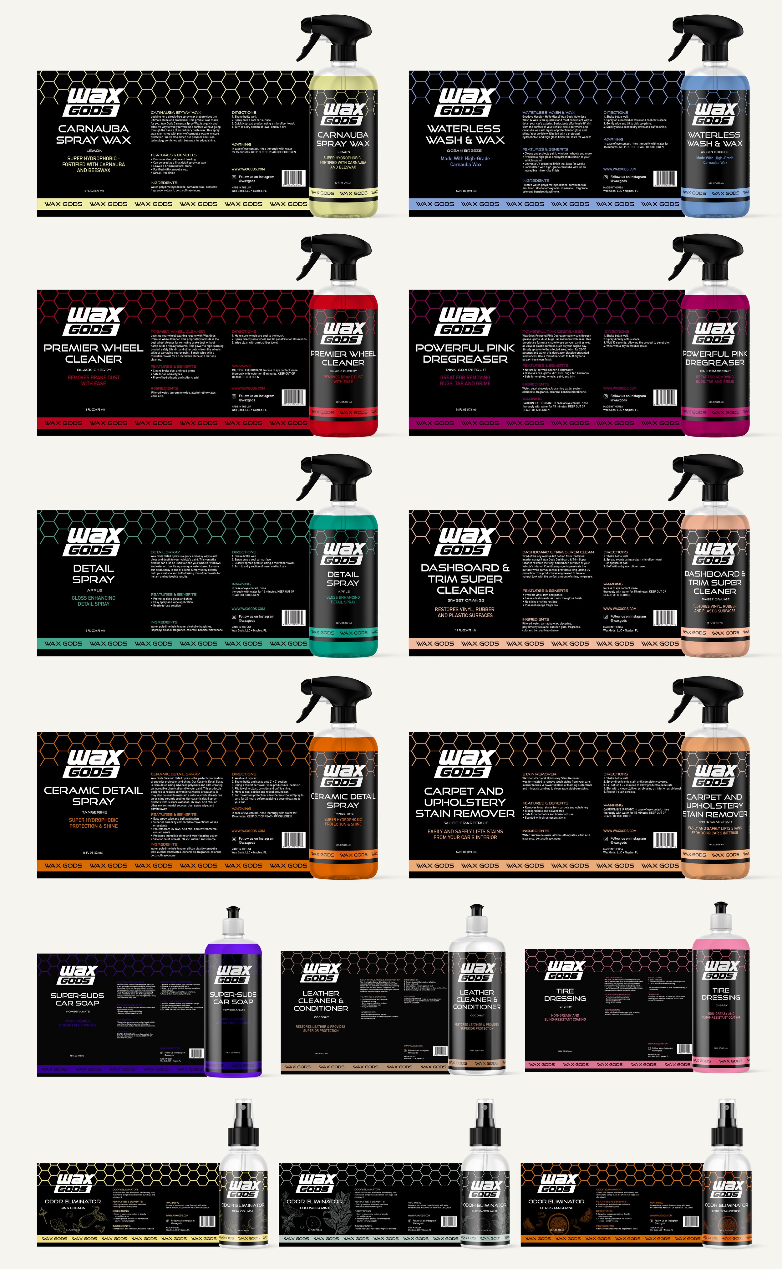
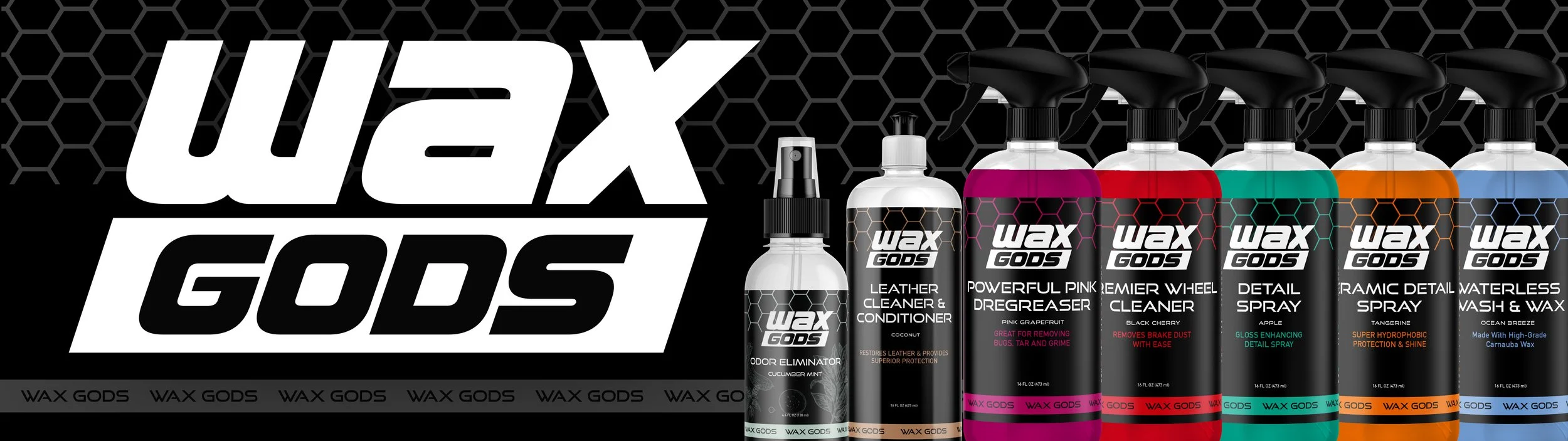
WaxGods needed packaging that not only looked sharp but worked seamlessly across their expanding product line. I created a universal label layout adaptable to various bottle types, ensuring consistency across the brand. To enhance the connection between product and presentation, each sub-graphic was color matched directly to the liquid inside, giving every label a distinctive but cohesive feel. The result is a packaging system that balances flexibility, clarity, and strong shelf presence.
Branding + Visual Identity
Packaging Design
Services Included: